Charles Chakkalo is a no-BS Amazon operator who’s been selling online since age 14. He runs multiple 7ish-figure eCommerce businesses and is the creator of "Just a Seller" — a seller-first newsletter serving real tactics, sharp commentary, and zero agency fluff. When he’s not managing warehouses or launching SKUs, he’s helping other sellers protect their margins and stay ahead of the platform chaos.
[JAS] I got you a free Prosper Ticket | I literally got an invoice by mail for 55¢
|

Just a Seller Newsletter
Charles Chakkalo is a no-BS Amazon operator who’s been selling online since age 14. He runs multiple 7ish-figure eCommerce businesses and is the creator of "Just a Seller" — a seller-first newsletter serving real tactics, sharp commentary, and zero agency fluff. When he’s not managing warehouses or launching SKUs, he’s helping other sellers protect their margins and stay ahead of the platform chaos.
Hey Just a Seller Fam, I write this to you on my way back from an awesome trip to Kevin King's Market Masters in Austin (I'll cover that later). Welcome to those of you who joined from then. But for now, there were a few developments I wanted to let you guys know about from running the business day to day. There can be tons of follow up to ask, you know what to do, reply, I see every one of those. I'd be more than happy to engage with you further. “ What is the highest cash back value you can...
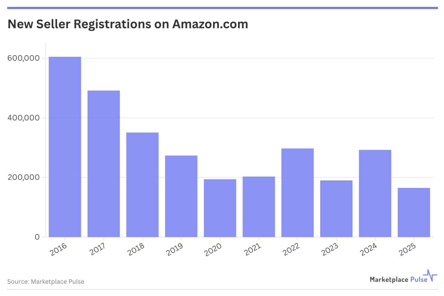
Ladies and Gents, November is upon us. Wow. So in eComm terms. Black friday/Cyber Monday is like next week when taking lead times into account. Amazon is up to shenanigans again after posting crazy profits (upwards of $42 Billion from sellers alone, no big deal). “ How much estimated GMV do US based sellers generate on Amazon? — Answer below This week in Amazon Stupidity We get it. Congress passed the INFORM Act is a silly attempt to make consumers safer. Meanwhile all it did was add red tape...
JAS Fam! Again, thanks for giving me the time and attention to intrude on your inbox. Before this value packed version below, a little about what I’ve been up to over the past few weeks. Without a doubt, most of you have been hearing from me via my welcome flow. But now I'm back and happier than ever to show you guys what I've been up to all August and September. What I've prepared for my beloved subscribers (because that's what you truly are, really, I promise) is a mini series on the...